This is a presentation video to be place in an exhibition. My role here is design slides content and editing it to a video. I also added music into the video to make it more lively. The video is not in high resolution for preview purposes. Check out the video below.
Read More ...
Flava website is customised to be viewed on the 3 main device iphone, ipad and computer screen resolution, therefore the design is designed to be flexible. Click here to check it out!
Read More ...
Jurid Enterprise is a spare parts distributor for heavy equipment. The company would want their company to look corporate and serious. Since this is a corporate website, I designed it sleek and neat. Click here to check it out!
Read More ...
Developing The Petite Park website is an enjoyment. The layout is very clean and neat. Click here to check it out!
Read More ...
Great World needs an ecard to sent to their clientele. They want the card to be simple like how I did for them for Christmas. So instead of just a static image with fading animation, I create an opening as an introductory to the card to make it more interesting. Click here to check it out!
Read More ...
Avana Style is a fashion website mainly for women. The design is feminine and each page is gracefully presented. Click here to check it out!
Read More ...
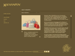
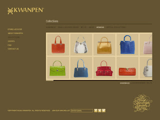
Kwanpen decide to give their website a new face lift, so I've created 3 full screen mock up website designs for them. I decide to design it all in full screen, so it will give the brand an elegant stylish look, like how their products is so elegantly match with their fashionable models.
Read More ...
Original Website Look
Design A
Design A (sub page)
Design A (sub page)
Design B
Design C
This is an animated flash ecard for Carlton Hotel to place on their homepage during the Chinese New Year season. I've inserted music for this project, so turn up the volume and enjoy the ecard's animation! Click here to check it out!
Read More ...
UOL requires a Chinese New Year E-card to send to their clientele. Therefore in the design of the e-card i create a simple and sophisticated look and develop a simple animated butterfly to make it look pleasantly beautiful. Click here to check it out!
Read More ...
By following the theme eco green, I design a modern yet simple masthead to accommodate the theme for BEX Asia. Click here to check it out!
Read More ...
Here is a bin sticker I design for Otto to be place in a college compound. Since it is place in a college compound, I decided to design it in a simple and informative way, so people will notice it and educate themselves at the same time.
Read More ...
Sembcorp's microsite is a flash base site that let users to learn more about it's essential solutions. Interactive navigations and animated charts were created to give user a better learning experience. Click here to check it out!
Read More ...
In this project, the requirement I receive from Great World is to create a static ecard with simple animations and so I find a suitable image, put in snowflakes and small little lights to create a comfort Christmas feeling. Click here to check it out!
Read More ...
In this project I have to do an update on the website and create new navigation next to the company's logo. The challenge I face here is to maintain and create the same outcome in HTML and flash. Click here to check it out.
Read More ...
This is an animated flash ecard for Carlton Hotel to place on their homepage during the Christmas season. It is a story about how Carlton light up this festive season! Remember turn on the volume and click here to check it out on Carlton's homepage! Furthermore, I also did another layout for Carlton for them to send to their clientele. Click here to view it!
Read More ...
JAE Auto website is a supplier for car parts. The development of the website was smooth and the navigation system is pretty easy for users to navigate. Click here to check it out!
Read More ...
Acromec's design is simple and modernize to showcase the company's portfolio and identity. It is user friendly and the info is refreshing to look at. Click here to check it out!
Read More ...
Norika wanted their map to be redesign as their old map wasn't clear and interesting enough. Below are the new designs I've design for Norika. Click here to check it out on their live site!
Read More ...
Main Office
Branch Office
Combining the artwork created by the people with autism as part of the layout and bright fun design with handwritten fonts is a great combination of designs to capture attention of users. Simple navigation is also created for user friendly purposes. Click here to check it out!
Read More ...
Bright Star is a car leasing service website. This project is pretty straightforward and the design is bright and clean to capture the attention of users. Click here to check it out!
Read More ...
Developing website and CMS system for client to update themselves. Interface design is clean and neat as the client requested. Click here to check it out.
Read More ...
I have done frequent updates for Carlton Hotel website. This time they want to create a new website for their sub branches. Therefore my role is to create a drop down menu on the main site and direct users to navigate from there. Check out the links below of each site.
Read More ...
Kampong 18 need their website to be revamp, so base on their old website I'm required to design something better and close to the company's website art style.
Click here to check it out.
Read More ...
Click here to check it out.
This is a simple formality design website to match the identity of the company.
http://www.premiumstaffing.com.sg
Read More ...
http://www.premiumstaffing.com.sg
The purpose of creating this work is to create awareness for Child Abuse. Here is the link.
http://www.samantha.goodluckwith.us/blog/video/Abuse.mov
Read More ...
http://www.samantha.goodluckwith.us/blog/video/Abuse.mov
“Nyamuk Man” is a movie title of a story which a guy who is always follower by many mosquitoes. Whatever he do to get rid of the mosquitoes, the mosquitoes will always be there to follow him. This leads to a comedy of how he get rids of mosquitoes with various ways. The design is a fusion of malay and western style like the title. Billboard and t-shirts will be the second medium to promote this movie.
Redesign Ikea’s brochure is quite challenging. Because the style and the feel of the design have to be there. In order to resume all these, the fonts in particular play a big role and the arrangement of items has to be neat and simple. The original brochure was quite messy, no breathing space to read, no alignment or grid system and the size of the picture were in consistent.
Before
After
The package is redesigned because the former package has weak design layout, pictures were pixelated, the logo spoil the design and typeface is not appropriate. All these problem has been improve with a little touch of refinement and color scheme has change to enhance the look of this product.
Before
After


